ADAMANT Explorer: Mobile and Small-Screen UX Overhaul
ADAMANT Explorer completed a focused pass over its mobile and small-screen behavior so dense blockchain data — tables, addresses, monitors, the peer map, and the network graph — stays readable and usable on phones and narrow viewports after the Vue redesign. The work merged into dev in Adamant-im/adamant-explorer#42, closing issues for display/mobile UX and WebSocket block confirmation noise, plus a follow-up fix for iOS focus zoom.
What changed by surface
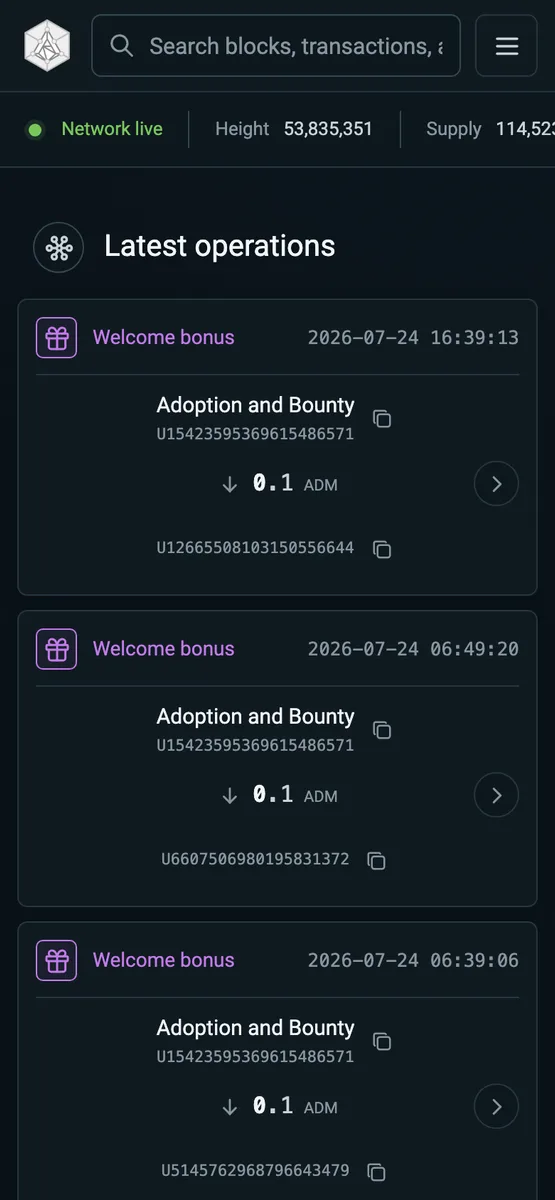
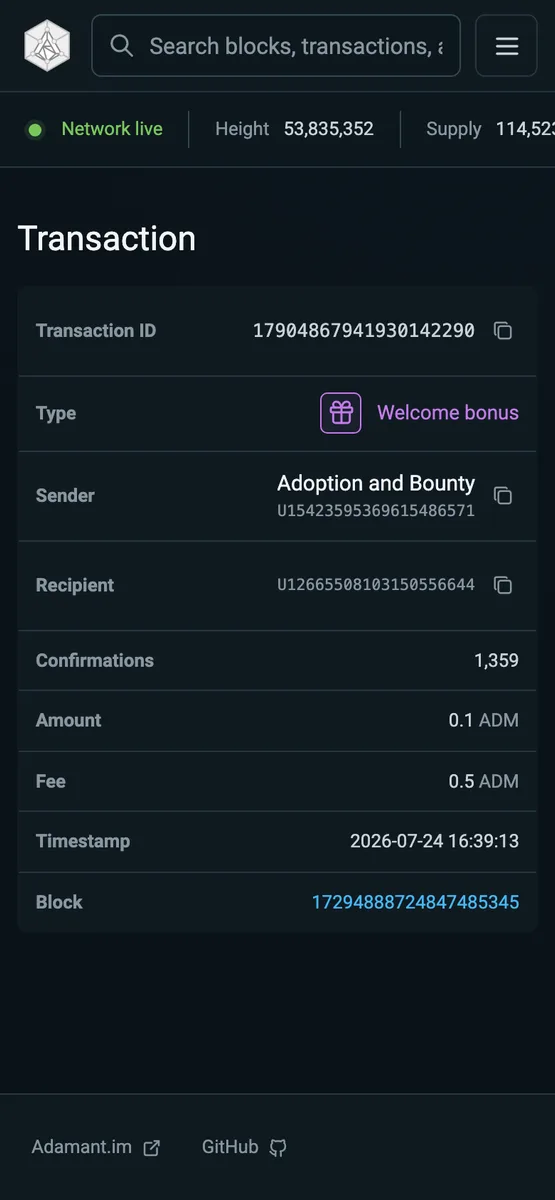
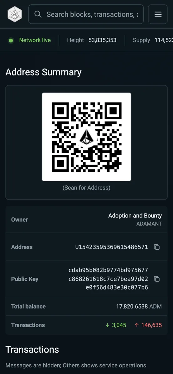
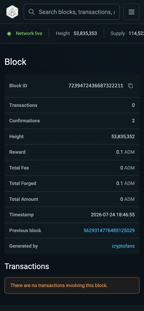
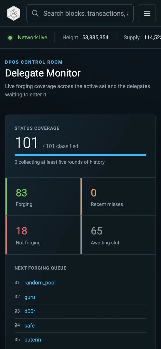
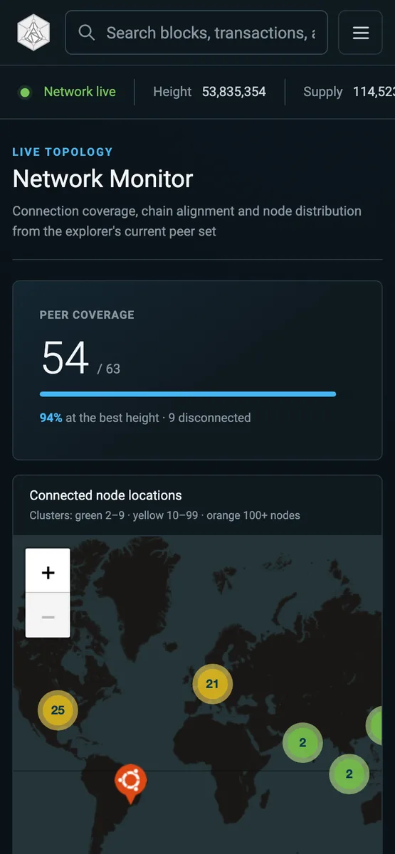
The universal search moved out of the collapsed menu into the top bar between the logo and the menu toggle, compacting on small screens while the network rail keeps a comfortable status inset. On the home page, the cramped table fallback is replaced by operation cards. Blocks, block, transaction, and address pages now use compact, scrollable transaction tables on mobile; the blocks list exposes a TXS count column, and the transaction page hides its duplicate ledger row. Delegate Monitor, Network Monitor peers, Top Accounts, and Reserved Wallets get .table-mobile card fallbacks, mobile sort controls, and refined ARIA. Custom tooltips dismiss on tap so touch devices are never left with a stuck tooltip, and the search field no longer triggers Safari’s zoom-and-scroll on focus.
Implementation notes
Two structural breakpoints drive the layout. At <=720px wide, data tables collapse into cards or compact scroll tables; at <=420px, those cards restack vertically. Desktop and tablet layouts above 720px are unchanged.
Each home row is a CSS-grid card. At <=720px the route runs on one line as sender -> recipient amount open; at <=420px it restacks with a centered down arrow and the amount beside it, with horizontally centered sender and recipient. Navigation and the tooltip are bound only to the explicit open control, not the whole card.
Block and address transaction lists stay real tables on mobile — horizontally scrollable inside their container with a fixed compact column set (Type, ID, Sender, Recipient, Amount; plus Date on the address page) and no per-row copy buttons. The block list drops sorting on mobile.
A subtle wrapping bug affected summary values: addresses and transaction IDs were being broken onto a lone trailing character even with room to spare. The root cause was a flex item with min-width: 0 and overflow-wrap: anywhere collapsing to its 1-character min-content contribution, so the copy button’s width forced a break. The value now grows to fill the cell (flex: 1), keeping addresses and transaction IDs on one line while public keys still wrap cleanly.
The single body-level tooltip becomes pointer-interactive only while visible and hides on pointerdown, guaranteeing an exit on touch where the auto-hide timer is not always reliable. For iOS, Mobile Safari zooms any focused input whose font is below 16px, which then leaves the page scrolled; the search input is pinned to 16px, while the viewport meta keeps user zoom enabled for accessibility.
Node WebSocket block confirmation
Compact WebSocket block notifications are hydrated through the Node REST API with a single bounded retry for the expected cross-node Block not found SQL-visibility lag. A height fallback must still confirm the announced block id and height. The first miss is logged at debug and a warn is emitted only when confirmation is genuinely exhausted, so routine cross-node timing no longer produces error noise. Node-only unit tests cover the retry, fallback, validation, and logging paths.
Validation
npm run lint, npm run format:check, and npm run test:unit (225 tests, including WebSocket block hydration) pass. git diff --check is clean, and desktop and tablet layouts above 720px are unchanged with no regression.