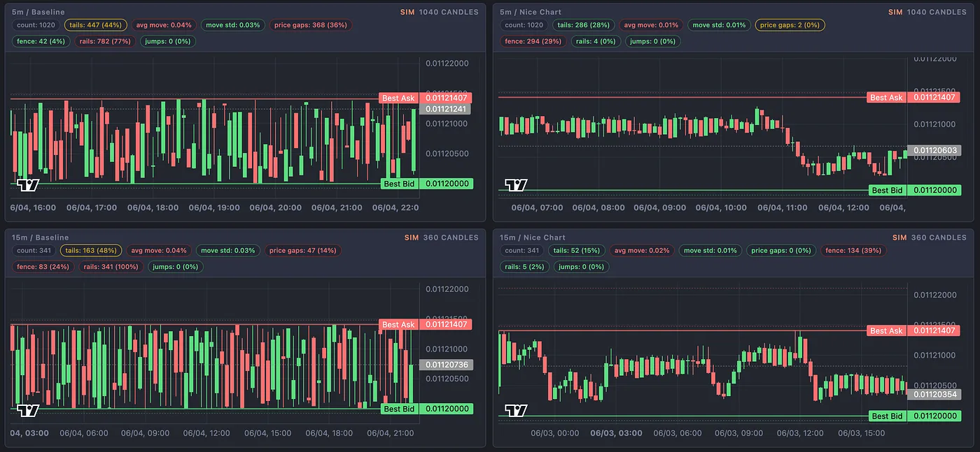
ADAMANT’s upgraded Nice Chart module shapes spot price action so a token looks alive, liquid, and intentional — not like a bot left the volume on and forgot the aesthetics. It ships in the Premium edition of the ADAMANT Trading & Market-making bot and is built for teams who care about perception as much as execution.
The chart is your storefront
On a centralized exchange, a token doesn’t get a pitch deck or a landing page first. It gets a candlestick chart. Traders, market makers, listing partners, and community members judge health in seconds: Are wicks natural? Does price drift smoothly or jerk in steps? Does volume look like a real market — or like software hammering the spread? Having a market-making bot is table stakes; how the chart feels is the differentiator.
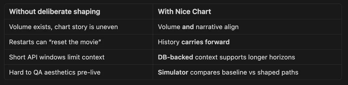
Classic in-spread volume bots do their job — they place orders, rotate inventory, and print tape. But without deliberate price shaping, charts often tell the wrong story: uneven candles, abrupt jumps that telegraph “algorithm” instead of “market,” artifacts after restarts, and short memory from exchange trade-history APIs that only reach back so far. The result isn’t always broken trading; it’s broken confidence.
Nice Chart doesn’t replace risk controls, spread maintenance, or liquidity modules. It layers intentional price aesthetics on top of the same operational guardrails you already rely on.
What Nice Chart does
Nice Chart is a dedicated price-shaping brain for the Trader module. While the bot still respects spread, Price Watcher bounds, MM policy, and order-book safety, Nice Chart continuously asks: given where we are in the candle and what history we know, what’s the most natural next print — without leaving our safe corridor?
In practice that means smoother, more believable candles with fewer harsh discontinuities; continuity across restarts where history is remembered rather than reinvented every deploy; graceful degradation when fresh exchange data is thin, leaning on accumulated history and warning clearly instead of guessing blindly; and best-effort candle closes where the bot can nudge toward a more coherent close when safety checks allow — never by overriding risk rules.
Under the hood
Nice Chart lives in its own module trade/mm_nice_chart.js and plugs into mm_trader via soft dependency loading. If the module isn’t present in a custom build, Trader keeps legacy behavior. If Nice Chart returns invalid output, Trader falls back — no hard crash, no silent override of safety. This architecture matters for Premium vs basic editions: advanced chart shaping ships where it belongs without forcing every deployment to carry the same surface area.
Exchange trade endpoints are short-lived, so Nice Chart pairs with a shared market-history layer that keeps a working in-memory state for the active market, persists candles to DB, retains roughly 90 days of history while shaping decisions against a ~30-day analysis window, and deduplicates trades on stable identity (trade id, timestamp, side/price fallbacks). The bot draws from a durable tape that survives restarts — critical for issuers who redeploy often.
Candles are built timeframe-agnostically from the same trade stream whether live or reviewing a report, reducing the classic risk of simulator-production divergence. Premium teams get an interactive HTML simulator trade/tests/nice_chart.test.js that renders multi-timeframe Lightweight Charts views, compares baseline vs Nice Chart paths on identical inputs, and supports snapshot (live exchange seed) and db (accumulated history) modes for qualitative QA before pointing real capital at the pair.
Safety stays upstream. Nice Chart proposes a constrained target envelope, not a free-form price. mm_trader intersects that envelope with spread limits, watcher constraints, policy-specific order-book rules, and liquidity checks before placement. Candle-close correction is best-effort and non-bypassing — aesthetics never win over execution safety.
Who this is for
Token issuers and crypto projects benefit because a chart is social proof; Nice Chart helps daily candles tell a story of organic activity rather than mechanical noise, especially on pairs where visual trust drives holder sentiment. Exchanges and market-making desks benefit because partners compare charts across venues, and a polished tape reduces “explain this wick” conversations. Power users on Premium builds get an aesthetic layer — the finishing pass on a stack already tuned for operations.
The open-source basic bot continues with the standard Trader path. Nice Chart is a Premium capability for teams that pay for advanced market presentation.
The goal isn’t a fake BTC chart on a microcap — it’s a chart that doesn’t distract from a token’s real story.
Practical usage
Conceptually, enable Trader on a spot Premium config with Nice Chart on, watch corridor narrowing and candle behavior over a session, then restart the bot and confirm continuity rather than amnesia. Visually, run the Nice Chart simulator against your config — trader mode with db seed is closest to what production remembers, while snapshot mode stress-tests cold-start behavior. Operationally, tune mm_minInterval with awareness; the bot warns when your Trader cadence pushes Nice Chart into a degraded closing-only rhythm, which is intentional transparency rather than hidden degradation.
Implementation track: Feature issue #94.
Every serious project can buy or operate market-making. Fewer invest in how their market looks hour to hour on the chart everyone screenshots. Nice Chart is ADAMANT’s answer for Premium clients who want the bot’s output to feel considered — smoother candles, steadier continuity, honest fallbacks, and tooling to see the difference before capital does.