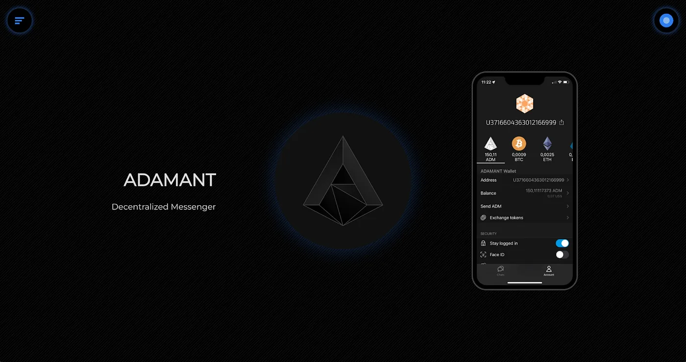
The redesign of adamant.im follows a “less is more” philosophy, stripping away unnecessary elements to deliver a clean, uncluttered interface. The minimalist approach prioritizes functionality and efficiency, giving users direct access to what they need.
Design and Layout
Navigation has been streamlined so users can find key sections without being overwhelmed by options. Typography improvements use space and contrast effectively to enhance readability, while the responsive layout adapts seamlessly across desktop and mobile devices. By minimizing decorative design elements, the site places greater emphasis on content itself.
Fewer graphical elements also contribute to faster loading times and a smoother browsing experience. The simplicity of the design reduces distractions, letting users focus on the content and functionality that matters most.
Page Structure
The main page opens with a looped demo of the ADAMANT app screens:
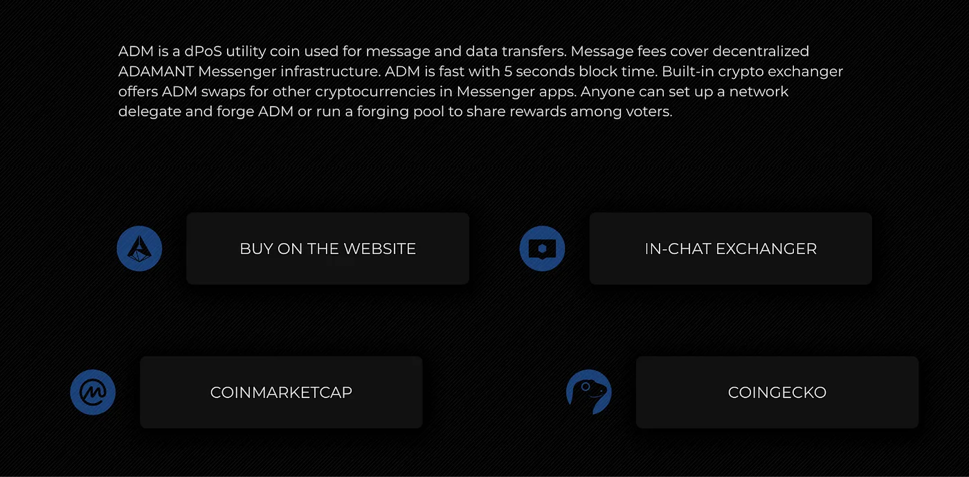
Below the demo, the main information section and app downloads follow. A Buy & Sell ADM section outlines ADM coin use cases and links to ADM markets.
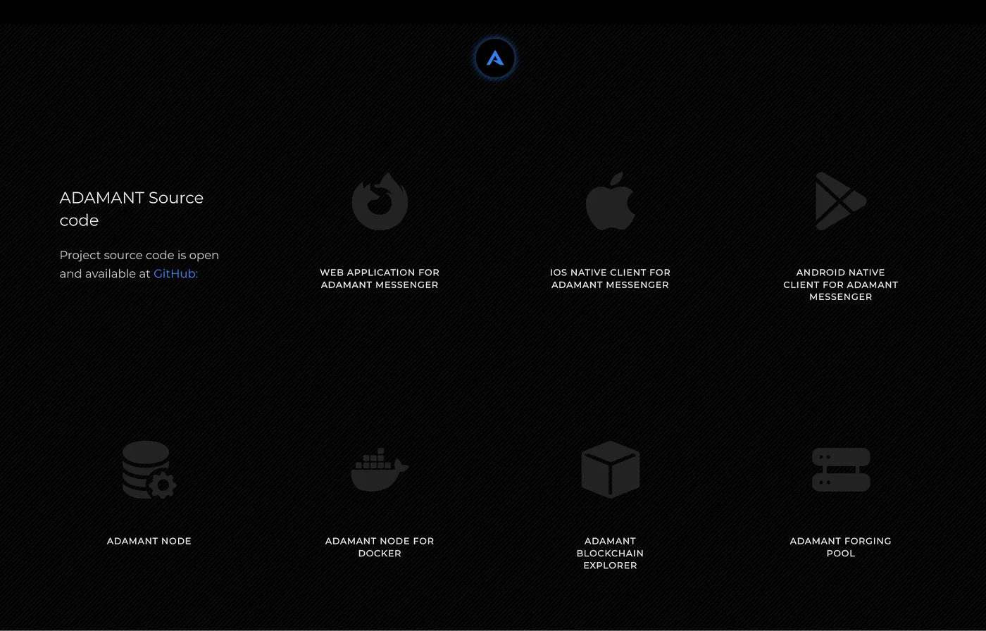
Footer and secondary navigation elements are hidden on all pages except the main page, keeping the focus on content:
Both dark and light themes are available.